 Helpdesk IBM SPSS Statistics 20 Helpdesk IBM SPSS Statistics 20For students from Arnhem Business School | ||||||||
| Home | Codebook | Data | Data editing | Analysis | Graphs | Settings | Links | Methods |
|
Helpdesk IBM SPSS Statistics 20 For students from Arnhem Business School | ||||||||
| Home | Codebook | Data | Data editing | Analysis | Graphs | Settings | Links | Methods |
Graphs Pie Chart
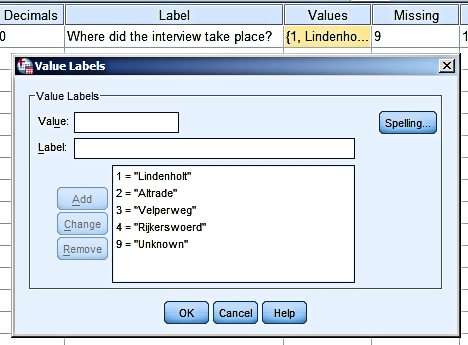
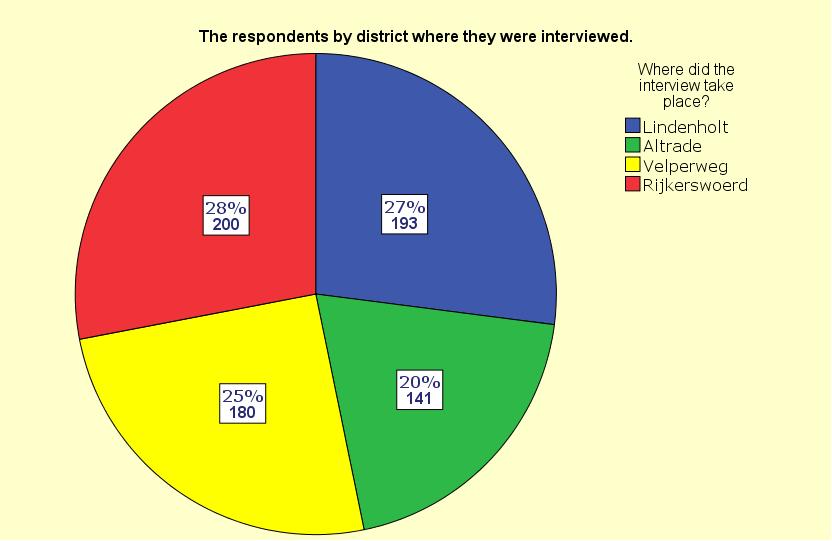
We surveyed 714 people and we recorded in which district the interview took
place. The variable
district has the following value codes: Coding:
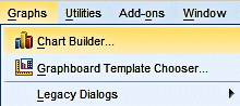
We want to construct a pie chart for this variable. In this example we use Graphs > Chart Builder...:
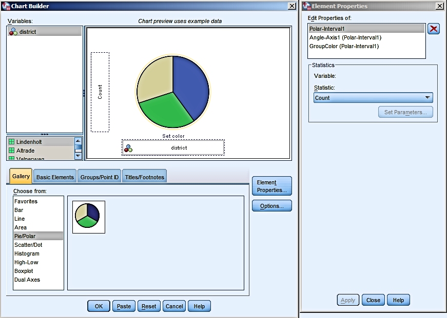
The Chart Builder dialog box opens.
We have chosen Pie/Polar, dragged the graph icon to the preview field and
dragged the variable District to the "Set Color" field.
The first result:
Clearly this graph needs editing. A title is missing. Depending on the
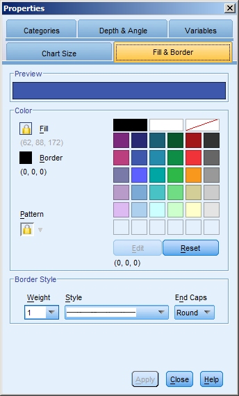
context where it will be published it might need a source. Double-clicking on the chart in the SPSS output windows opens the graph in a new Chart Editor window.
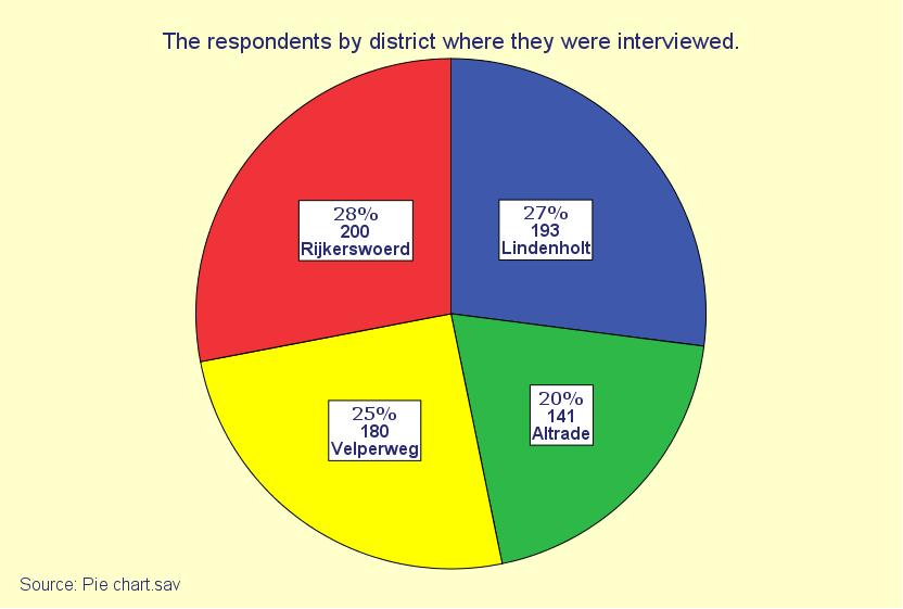
Editing:
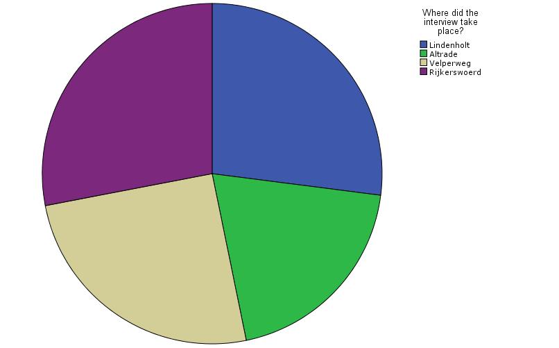
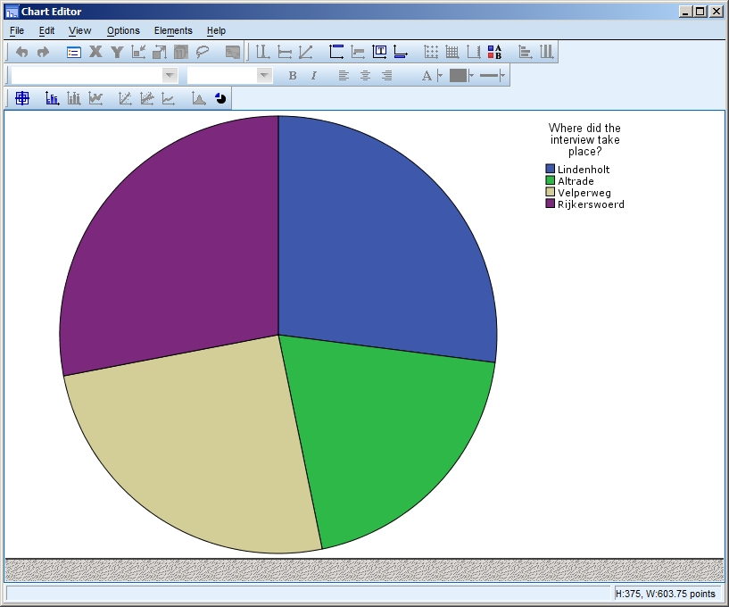
Below you see the pie chart after some editing. Try and get a similar result yourself.
The edited result:
Or it could be like this:
Note: Copying and pasting graphs into
Word works fine most of the time, but not always.
|
Last modified
30-10-2012
 © Jos Seegers, 2009; English version by Gé Groenewegen. |