 Helpdesk IBM SPSS Statistics 20 Helpdesk IBM SPSS Statistics 20METHODS | |||||||
| Introduction | Sample size | Table design | Graph design | Syntax | Testing | Links | SPSS Statistics 20 |
|
Helpdesk IBM SPSS Statistics 20 METHODS | |||||||
| Introduction | Sample size | Table design | Graph design | Syntax | Testing | Links | SPSS Statistics 20 |
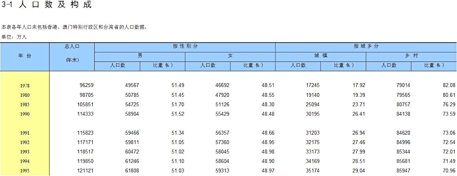
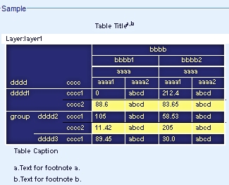
Table DesignA first exampleIn the Statistical Yearbook 2009 from Statistics China the following table appears (only partly shown here):
Most people won't be able to read it. But everyone will recognize the structure of this table.
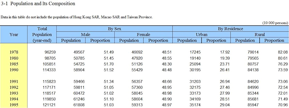
Now have a look at the English version of this table. It has the same structure, but now you can read the titles and headings.
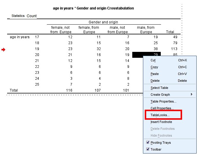
SPSS TableLooksIf you have a table in the SPSS output you can double-click on it to open it in edit mode. If you then right-click somewhere in the table, a context menu pops up that includes the option "TableLooks...". Through it you have access to a number of predefined designs for your table.
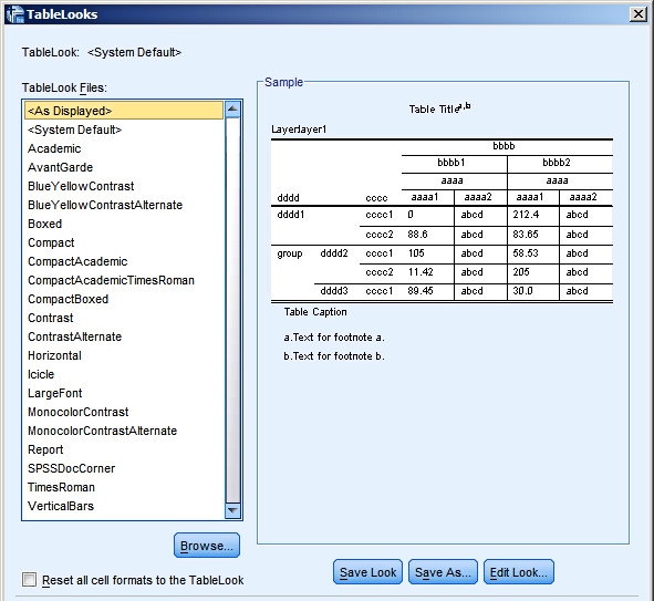
The list with predefined looks that ships with SPSS 20 is already quite extensive. But if you want a special look, for example based on your company's design schemes, you can create your own look, save it and apply it to new tables.
Note: If you can't find the proper look in SPSS, an alternative is to copy the table from the output into Word and to do the editing there.
Some literature
|
Last modified
30-10-2012
 © Jos Seegers, 2009; English version by Gé Groenewegen. |