 Helpdesk IBM SPSS Statistics 20 Helpdesk IBM SPSS Statistics 20METHODS | |||||||
| Introduction | Sample size | Table design | Graph design | Syntax | Testing | Links | SPSS Statistics 20 |
|
Helpdesk IBM SPSS Statistics 20 METHODS | |||||||
| Introduction | Sample size | Table design | Graph design | Syntax | Testing | Links | SPSS Statistics 20 |
Graph DesignThere are numerous books and articles about graphs and about what makes a good one.
On this page we remind you of some basic guidelines and guide you to a few examples
of good and poor practices.
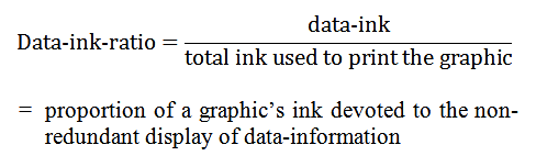
A good graph has a high data-ink ratio. This concept stems from the famous book by Edward R. Tufte: The Visual Display of Quantitative Information. It is defined as:
There are many books on things that may go wrong in the graphical display of data. For example have a look at "How to Display Data Badly" (pdf, 5 MB). This is chapter 1 of the book by Howard Wainer: Visual Revelations; Graphical Tales of Fate and Deception from Napoleon Bonaparte to Ross Perot. On this site we have pages with some remarks regarding the following topics:
|
Last modified
30-10-2012
 © Jos Seegers, 2009; English version by Gé Groenewegen. |