 Helpdesk IBM SPSS Statistics 20 Helpdesk IBM SPSS Statistics 20METHODS | |||||||
| Introduction | Sample size | Table design | Graph design | Syntax | Testing | Links | SPSS Statistics 20 |
|
Helpdesk IBM SPSS Statistics 20 METHODS | |||||||
| Introduction | Sample size | Table design | Graph design | Syntax | Testing | Links | SPSS Statistics 20 |
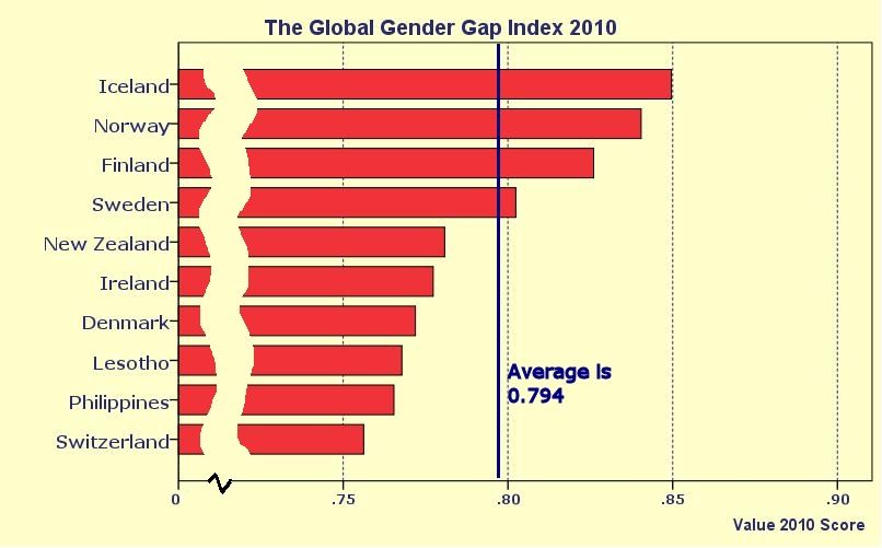
The scale axis used in a bar chart
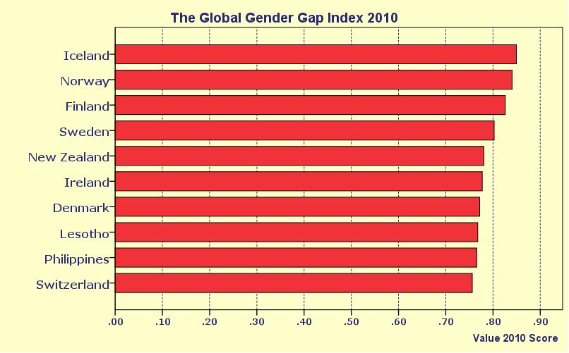
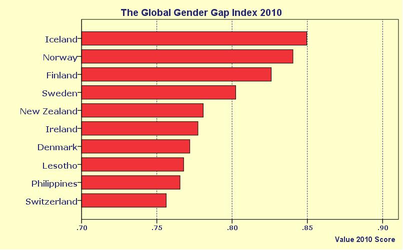
A bar chart seems simple enough, but if you are not careful the picture it shows can distort the data substantially. If you look at the bars you expect their sizes to correspond to the data they represent. But people are easily tempted to adjust the scale. Look at the following example:
This graph is based on table 3a from the
Global Gender Gap Report 2010, published by the
World Economic Forum. What a lot of people don't like about this display are
the large bars that are all about the same size. There is a
lot of red and we don't see much difference.
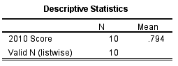
Now we see the differences. But we see them exagerated. Judging by the bars, the index for Iceland seems three times as large as that for Switzerland. By cutting the part from 0 to 0.70 the sizes of the bars no longer match the data they display. Is there a way to have your cake and eat it at the same time? One possible solution is to create a new reference point for comparing the countries. We calculate the average index score of the ten countries in the story:
The zig-zag mark and the the erased parts of the bars clearly indicate that the full lengths of the bars are not given. The blue line is the new reference and we can see how far above or below that average each country performs. Please note that this third version of the graph is not made entirely in SPSS. We have exported the SPSS chart and adjusted it in a photo editing program. |
Last modified
30-10-2012
 © Jos Seegers, 2009; English version by Gé Groenewegen. |
 and we use this to create a new point of reference for the viewers: