 Helpdesk IBM SPSS Statistics 20 Helpdesk IBM SPSS Statistics 20For students from Arnhem Business School | ||||||||
| Home | Codebook | Data | Data editing | Analysis | Graphs | Settings | Links | Methods |
|
Helpdesk IBM SPSS Statistics 20 For students from Arnhem Business School | ||||||||
| Home | Codebook | Data | Data editing | Analysis | Graphs | Settings | Links | Methods |
Graphs Histogram
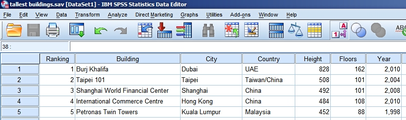
In this example we use data about the tallest buildings in the world. This data
comes from Wikipedia and was downloaded and edited in September 2011. Surely
there is an update of this data available at the moment. Coding:
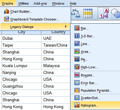
We want to show the height distribution of these sky scrapers by means of a histogram. In this example we use Graphs > Legacy Dialogs > Histogram...:
We have only filled in the variable to use (Height). There is no need to
panel the graph - which means that SPSS draws histograms for subgroups based on
the panelling variable.
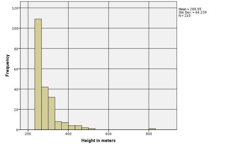
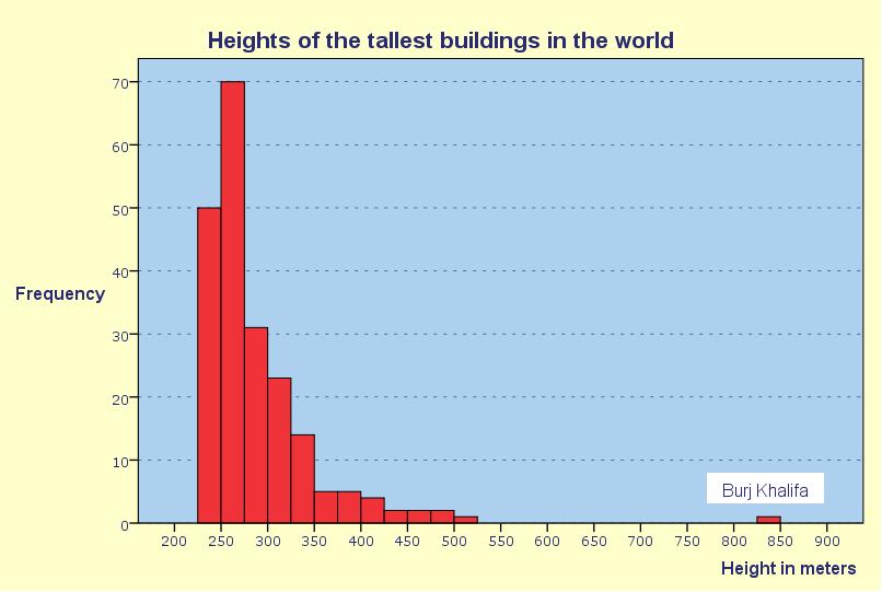
The first Result
Clearly this graph needs editing. We know we have to add a title. The Burj Khalifa is an extreme outlier that on its own uses half of the available image space. Do we want this or not? And do we want to keep the statistics in the upper right corner in the graph? SPSS has automatically created a set of classes for this
scale variable. Is it the right choice for us or do we want
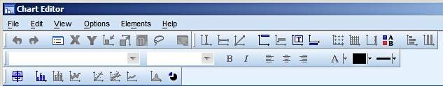
to change it? Double clicking on the chart in the SPSS output windows opens the graph in a new Chart Editor window.
Editing:
The edited result:
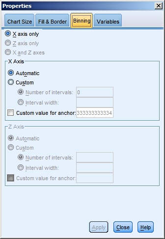
In the plot we have edited a number of things but we kept the scale intact, so that all buildings would show up in the picture and the extreme size of the Burj Kalifa is emphasized. We have changed the binning. The class width is now 25 m and the first class starts at 225 m. Also the scaling of the vertical axis has changed. Note: Copying and pasting graphs into
Word works fine most of the time, but not always. Note: If you find it hard to add a text field in the SPSS chart, don't hesitate to export the chart and continue your editing in another program of your choice.
About binning
If you like you can have a look at the applet we used to create these pictures.
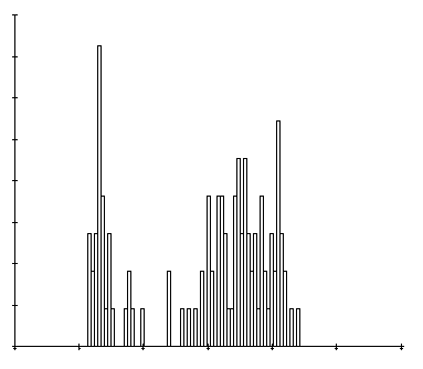
When you ask for a histogram in SPSS the
program uses the data range and the number of observations
to make a set of classes for the graph. Often this will give
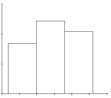
an acceptable result, but not always. Have a look at the
examples below. The first one looks like the spiky graph we
dismissed
above. The spikes obscure the global picture.
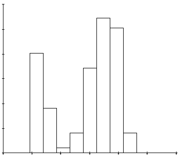
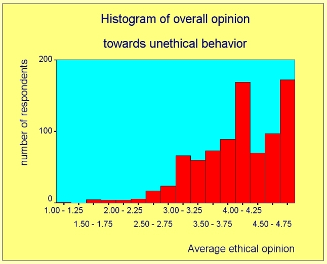
We will examine a second example in some
more detail.
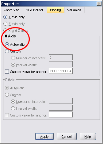
It is immediately clear that the labeling is horrible, but that is another story. It is also clear that the automatically generated set of classes results in a spiky graph with gaps between bars that don't seem to to justified. So how can we set this right? By double clicking on the chart in the output window of SPSS you open it in its own editing window.
Experiment a little with the settings at your disposal until you are satisfied with the result.
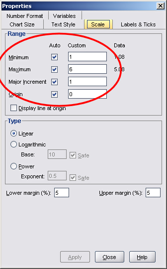
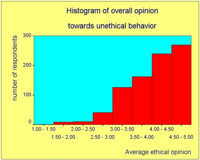
As you can see, we have plenty of tools for a proper axis display at our disposal. A decent result might look like this.
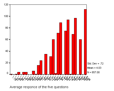
By taking a class width of 0.5 instead of 0.25 we get a result that is too coarse, as you can see in the picture below.
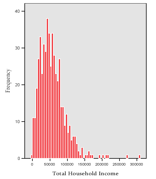
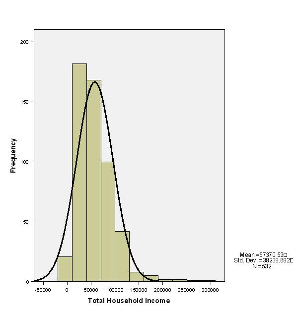
Choose the class limits wisely The graph below is another example from students' work. In this case the class width is Can$ 30,000.
And also ask yourself if you really want a normal curve superimposed over the histogram. Is there any need for you to assess whether the income distribution is approximately normal? If the answer is "no", leave the curve out.
|
Last modified
30-10-2012
 © Jos Seegers, 2009; English version by Gé Groenewegen. |