 Helpdesk IBM SPSS Statistics 20 Helpdesk IBM SPSS Statistics 20METHODS | |||||||
| Introduction | Sample size | Table design | Graph design | Syntax | Testing | Links | SPSS Statistics 20 |
|
Helpdesk IBM SPSS Statistics 20 METHODS | |||||||
| Introduction | Sample size | Table design | Graph design | Syntax | Testing | Links | SPSS Statistics 20 |
Comparing a line chart to a scatter diagram
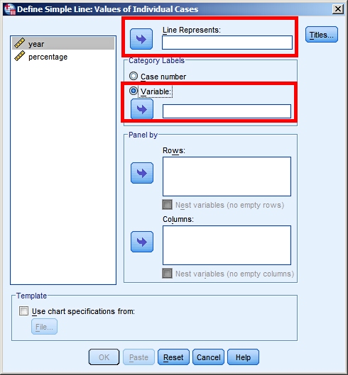
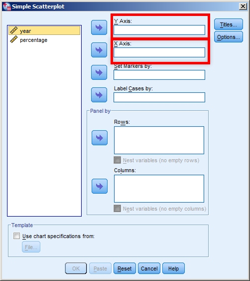
What is the fundamental difference between making a line chart and a scatter diagram in SPSS? To answer this question we look at the dialog boxes for both types of charts.
We use as our example a report from the German BDEW (Bundesverband
der Energie- und Wasserwirtschaft). In a paper from
January 2012 they show the percentage of electricy produced
by renewable sources in the past years and the government's
targets for the next fourty years (Erneuerbare
Energien und das EEG: Zahlen, Fakten, Grafiken 2011,
data on page 10 of the document) (links checked on 10 June
2012). We want to present this data in a graph with time on the horizontal axis and the percentages vertical. Have a look at the line chart approach versus the scatter diagram approach.
The key difference lies in the control we have over the horizontal axis.
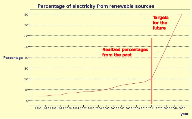
So the key difference is that for a line chart the years are pieces of text that are placed, equally spaced, along the horizontal axis. In a scatter diagram on the other hand the years are numbers and distances between these numbers are plotted correctly. This leads to the following two graphs. Looking at this line chart we think we see a clear trend breach between what the German government has realized in the past versus what their ambitions are for the future. It is only when we look closer at the horizontal axis that we notice the non-linearity of the scale, with steps of one year for the realized percentages and steps of nine and ten years for the future targets. Watch the difference with the scatter diagram, where the horizontal axis is a true scale axis.
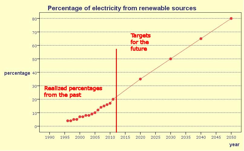
Now we see the truth of the policy set out by the German government. Over the past fifteen years they have steadily built and increased the percentage of electricity from renewable sources. The increase is more or less linear, and the long term plan of the government is to maintain this linear growth and by 2050 have 80% of their energy from renewable sources. A final note: If you use Chart Builder in SPSS and you
have set the measurement level for year at "scale" (as it
should be), then SPSS will prevent the incorrect graph from
being created. Instead it will make a line chart with a
correct scale on the horizontal axis. |
Last modified
30-10-2012
 © Jos Seegers, 2009; English version by Gé Groenewegen. |