 Helpdesk IBM SPSS Statistics 20 Helpdesk IBM SPSS Statistics 20METHODS | |||||||
| Introduction | Sample size | Table design | Graph design | Syntax | Testing | Links | SPSS Statistics 20 |
|
Helpdesk IBM SPSS Statistics 20 METHODS | |||||||
| Introduction | Sample size | Table design | Graph design | Syntax | Testing | Links | SPSS Statistics 20 |
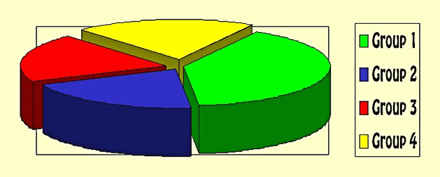
About 3D charts
3D-charts may look fancy, but they easily distort the truth
due to their display.
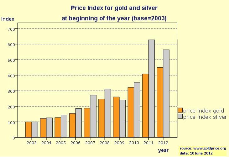
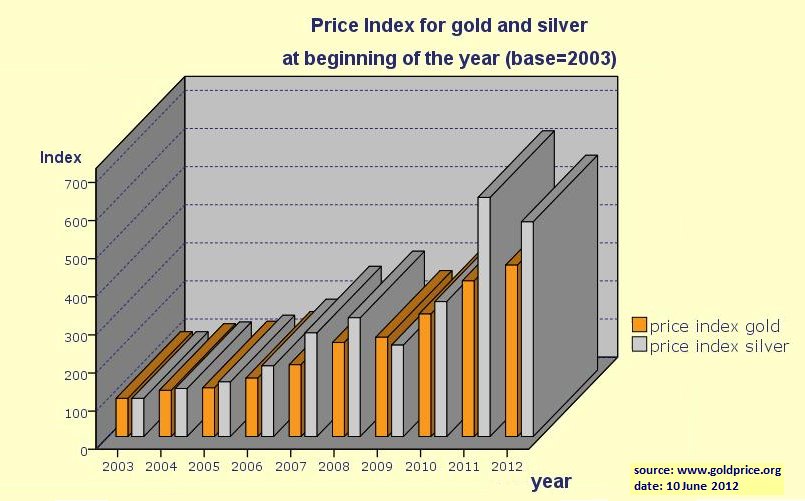
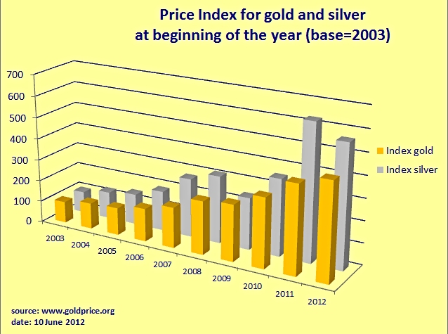
Now have a look at the underlying data: pie chart of four groups.xls (Excel, 31 KB). Draw your own conclusions. Here is a second example of the effects a 3D design can have. We show price indexes for gold and silver for a period of ten years, both in 2D and in 3D design. The first two graphs are made in SPSS, the third one in Excel. We leave the comments to the reader. Ask yourself the following questions: Which of these graphs is the most impressive? Which one is the most informative?
The moral of these examples3D is meant to impress, not to inform people(which of course is fine if being impressive is your goal with a graph.) |
Last modified
30-10-2012
 © Jos Seegers, 2009; English version by Gé Groenewegen. |