 Helpdesk IBM SPSS Statistics 20 Helpdesk IBM SPSS Statistics 20For students from Arnhem Business School | ||||||||
| Home | Codebook | Data | Data editing | Analysis | Graphs | Settings | Links | Methods |
|
Helpdesk IBM SPSS Statistics 20 For students from Arnhem Business School | ||||||||
| Home | Codebook | Data | Data editing | Analysis | Graphs | Settings | Links | Methods |
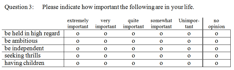
Graphs Bar chart for a set of Likert scale questionsElsewhere on this site we discussed how to make a table for the situation
described in the title. You find it at
Custom Table for a Set of Likert Scale Questions.
The Questions:
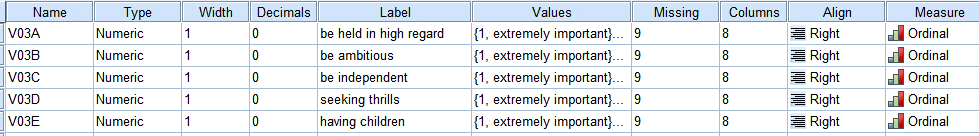
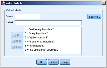
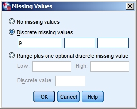
Coding:
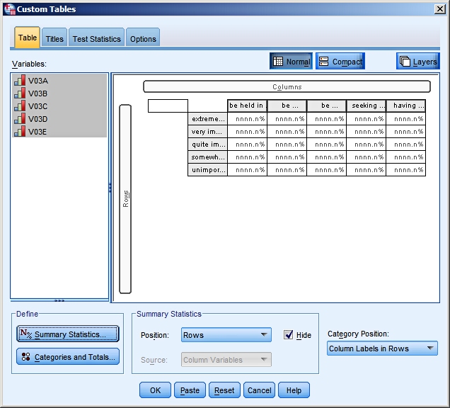
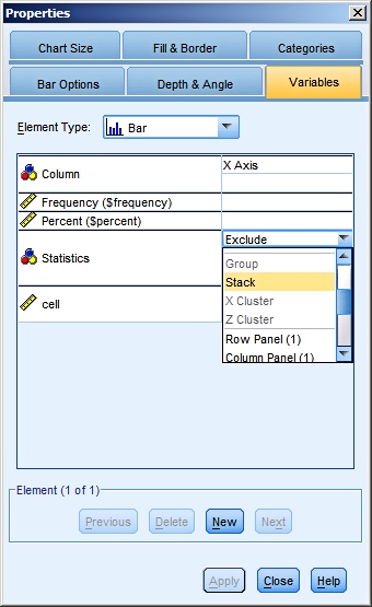
How to make the graph?This is not as straightforward as most graphs. We will
show step by step how to get the nice result you find at the
end of this page. To get the chart we want, we have to do things a little different here. We put the variables in the columns (instead of in the rows), we ask for column percentages but no counts, and we choose for the Category Position the option "Column Labels in Rows". We don't want any totals in the table.
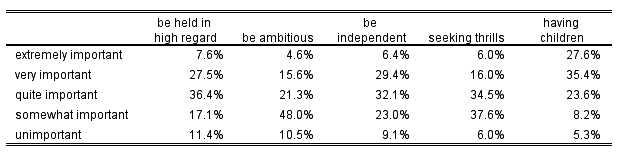
The resulting table looks like this:
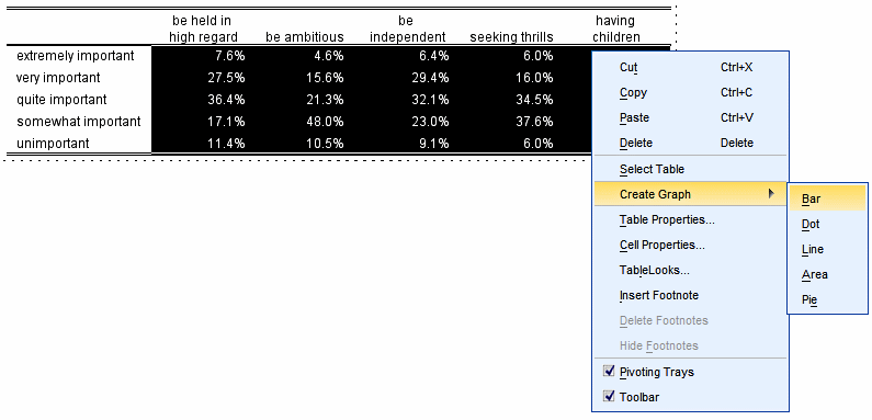
Next you double-click on this table to get it into edit
mode.
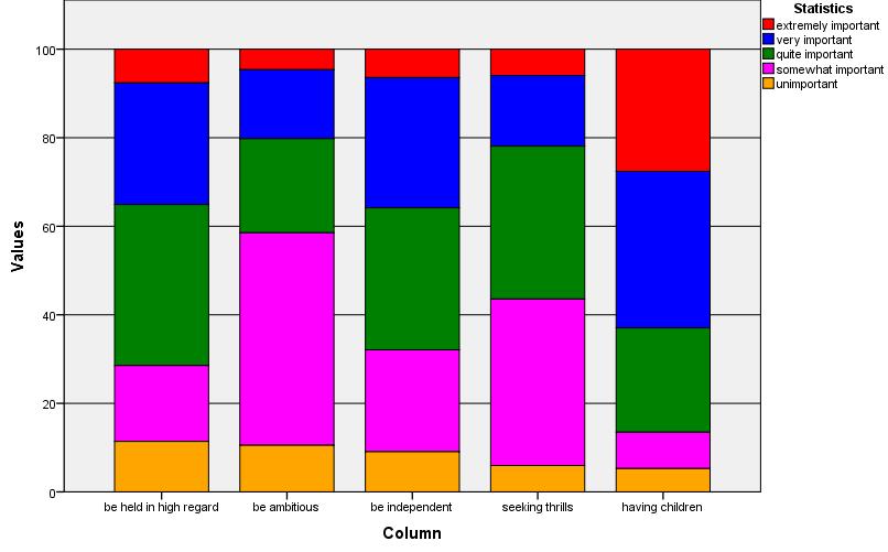
The first result:
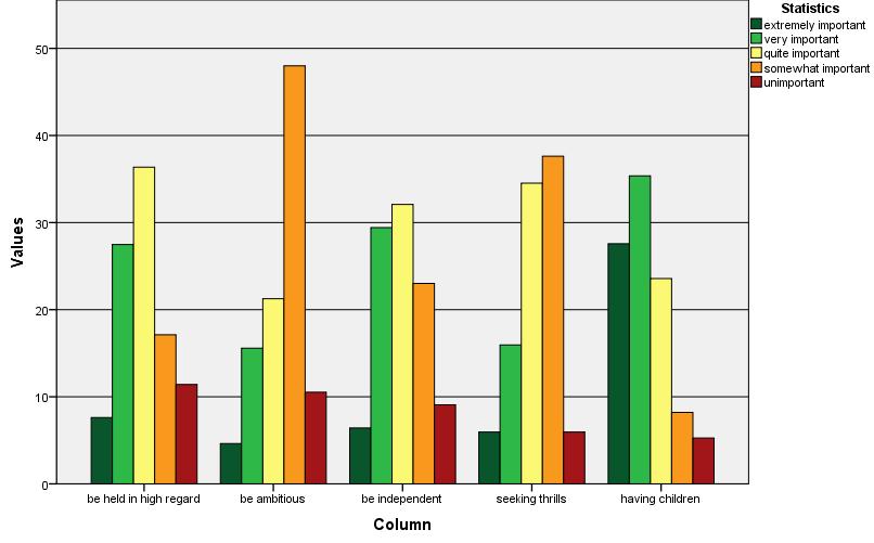
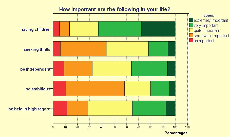
The edited result:
One clearly sees that "having children" is most important while "be ambitious" is the least important aspect in the respondents' lives.
|
Last modified
30-10-2012
 © Jos Seegers, 2009; English version by Gé Groenewegen. |