 Helpdesk IBM SPSS Statistics 20 Helpdesk IBM SPSS Statistics 20For students from Arnhem Business School | ||||||||
| Home | Codebook | Data | Data editing | Analysis | Graphs | Settings | Links | Methods |
|
Helpdesk IBM SPSS Statistics 20 For students from Arnhem Business School | ||||||||
| Home | Codebook | Data | Data editing | Analysis | Graphs | Settings | Links | Methods |
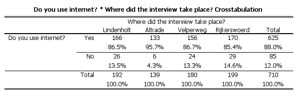
Graphs Visualization of a crosstabulationThere are many different graphs available in SPSS. The graph that we build uses the same dataset as the page about the chi-square test. There we made a stacked bar chart to visualize the crosstabulation (see Post-hoc analysis answer 2).
IntroductionIn several districts in both Arnhem and Nijmegen research has been carried
out to investigate the
internet use of people in those districts (survey data from Spring 2004).
The table itself is clear enough. Nevertheless sometimes you want a visual
display of it.
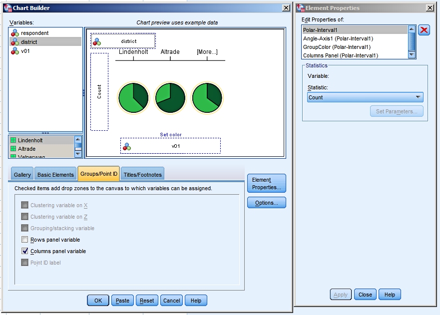
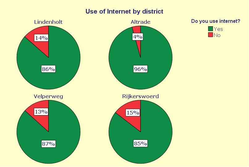
Using Chart BuilderOur first step is to open the Chart Builder window. We choose a pie chart.
The first result
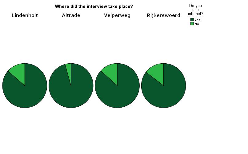
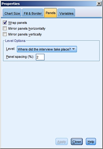
Editing the lay-outIf you double-click on the graph in the output it will open in its own Chart Editor Window.
In our example we have added a title, added percentages to the slices of the pie and we have experimented with colors and fonts.
The edited graph
We are not saying that this is the only way to visualize the crosstabulation (nor the best way), but it shows you some of the possibilites offered by SPSS. The one thing that stands out now is the difference between Altrade and the other three district. Altrade clearly has the highest internet usage rate. Try to make this graph yourself using the sample data set. Because the best way to learn about these kinds of techniques is by experimenting with them.
|
Last modified
30-10-2012
 © Jos Seegers, 2009; English version by Gé Groenewegen. |