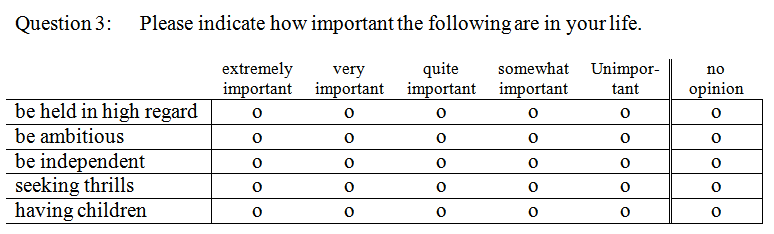
Analysis Custom Table for a Set of Likert Scale
Questions
In many market research situations you will ask people several questions that
have the same set of answer categories. The most obvious example is when you
ask an opinion on various aspects of life, the universe or your products and
services.
It would be nice to have one table where the answers to all these
questions are shown together. On this page we show you how this can be
accomplished.
The processing of such a set of variables to make the required table takes several steps:
Note: It would be nice to have a stacked bar chart
visualizing the created table as well. How that is accomplishes is
shown on a separate page.
See the section on Graphs:
Bar
chart for a set of Likert scale questions.

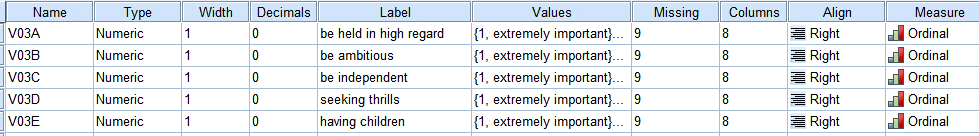
The value codes for all variables are the same. Their meaning is:
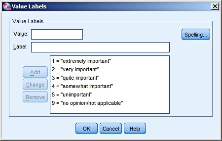 |
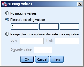
So 9 is defined as missing value. |
Note: The common part of the question ("Please indicate how
important the following are in your life") is not included in the variable
labels. This common part will be in the title of the resulting table.
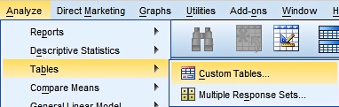
We choose
from the Menu:
Analyze > Tables >
Custom Table:
|
|
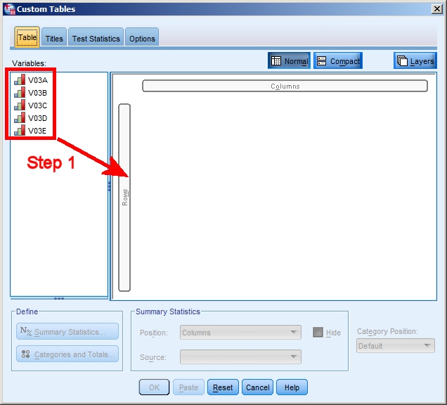
Step 1 is to select the
variables and to drag them to the position
"Rows".
It is important that the the level of
measurement of all variables is set correctly,
because the default settings for the table will
be based on that.
It is also important that all variables have
exactly the same value labels. Only then can
SPSS use them for the labeling in the table.
Using copy-paste in the Variable View Window you
can easily correct any differences. |
|
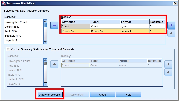
Step 2: We click the button
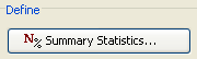 to select the statistics we want to display in
our table.
to select the statistics we want to display in
our table.
The window shown on the right pops up. We can
add statistics to the table and we can remove
some.
In this example we have chosen to select Count
and Row N% (row percentages; we want them
displayed to one decimal).
Note that you can rearrange the order in which
the selected statistics will be displayed.
If you are satisfied with your selection you
click on "Apply to Selection".
Note that next to statistics you can also ask
for Totals using
 |
|
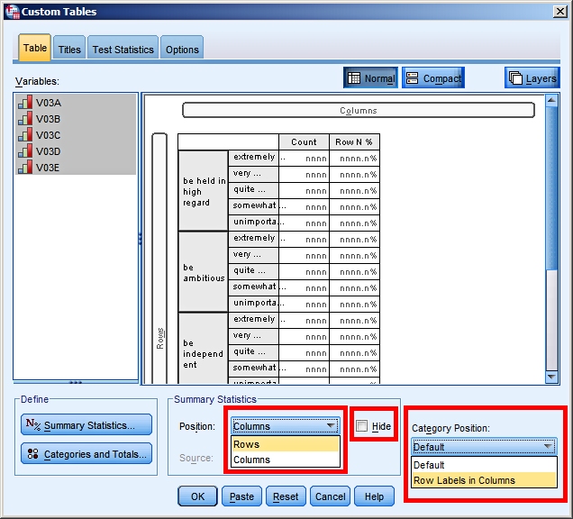
In
step 3 we edit the display
of the data.
By default the Statistics appear in the columns.
We change that to Rows.
We also tick the box for "Hide". This will hide
the labels for Count and Row N%. We don't want
them, since the data speak for themselves in
this case.
By default the value labels for our variables
are positioned in the Rows. We change that to
Columns.
Note that there are other tabs available. For
example you can give your table a title.
|
|
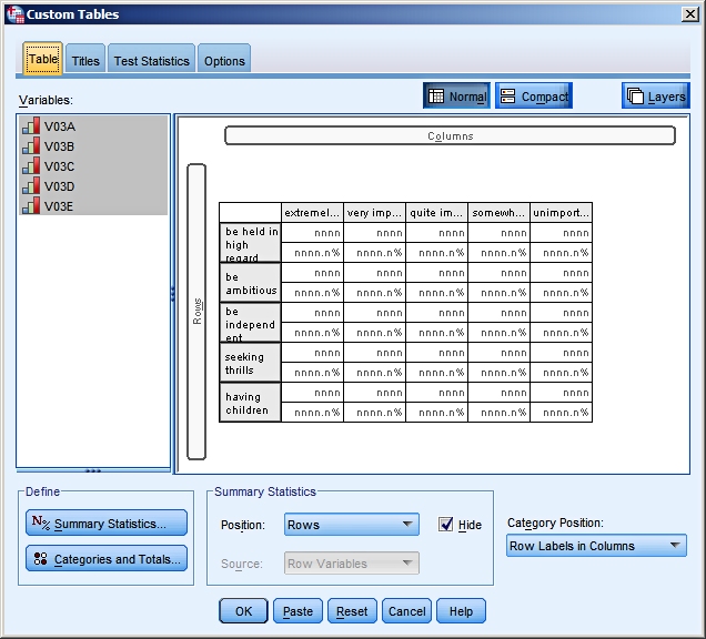
The preview will give you an
indication of what your table will look like.
If you are satisfied with it click on OK.
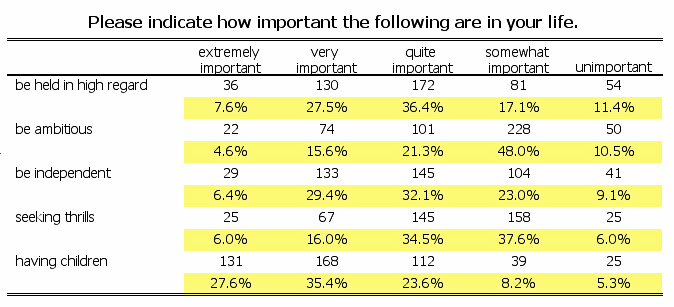
Finally:
Once your table is produced you can edit it
further like any piece of SPSS Output by
double-clicking on it. |
 |
Note: Custom Tables is a powerful menu option with a lot of possibilities. We have shown you just one nice and useful table.
Experiment and consult the SPSS Help to gain further insights into Custom
Tables.
|  Helpdesk IBM SPSS Statistics 20